Strutfit
The Context
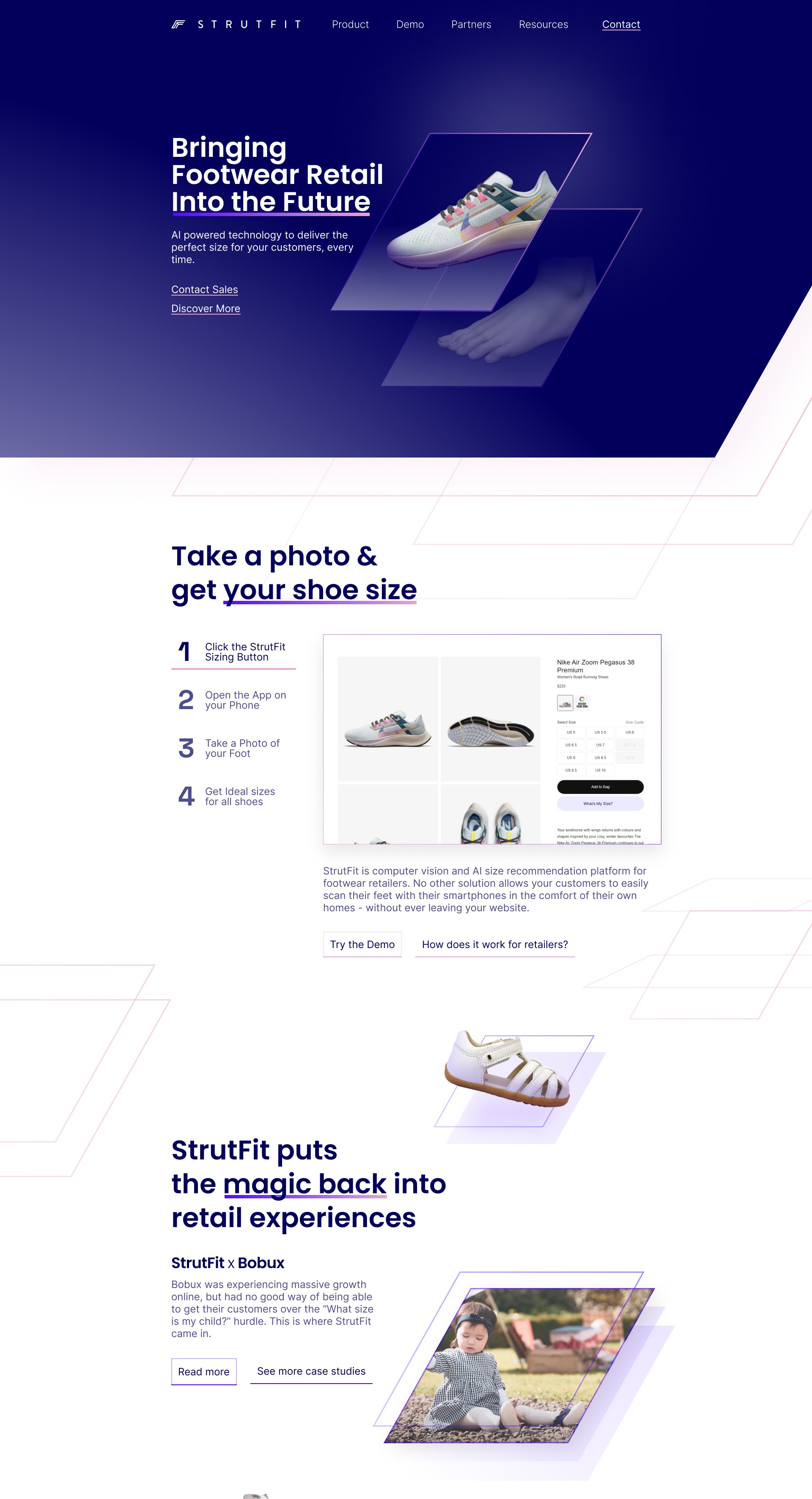
Strutfit is a B2B footwear technology company that helps online shoe stores build customer confidence through camera aided sizing recommendations, and as their business grew, their site needed a full overhaul to properly support this core experience.
The Story
I was brought into Strutfit's story as part of a team of three, working alongside Ian Loh as PM and Design Lead, and Judy Jin on Brand Design, with my role focused on revitalising the experience and information hierarchy of their new site.
The Problem at Hand
The challenge was to redesign a site serving two very different audiences, the retailers buying the technology and the shoppers using it, while untangling existing friction across the site and ensuring the experience and growing brand worked in harmony throughout.
The Outcome
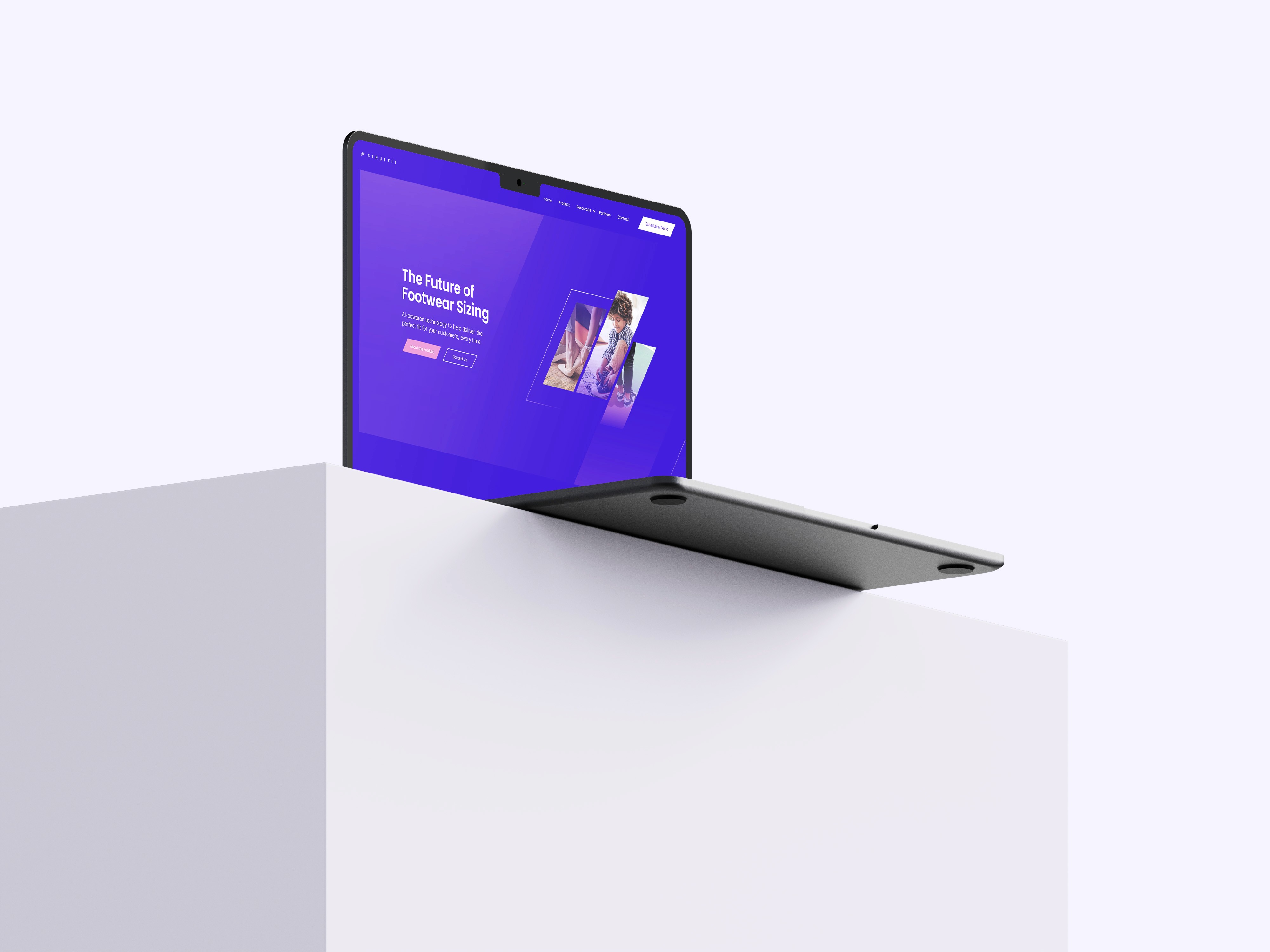
Together we delivered a site layout and flow built around a clearer information hierarchy, giving Strutfit's two audiences a site experience that properly supports their decision making and reflects the sophistication of the product itself.
Read about the design process ↓

Building the Foundation
Strutfit's target audience could be broken into two key categories, digital shoe retailers, the primary customers, and online shoe shoppers, the end users. By analysing their site's analytical data, conducting user interviews and testing the product, we developed a few key HMW questions, what the client's requirements were, and what our approach to addressing these points would be.
Defining How Might We's


Team Requirements

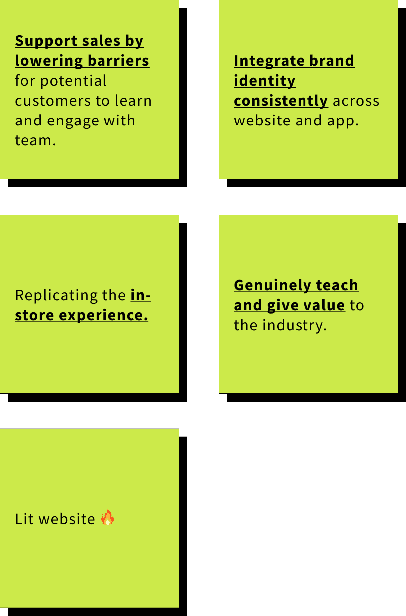
Our High Level Approach


Analysing the Site Map
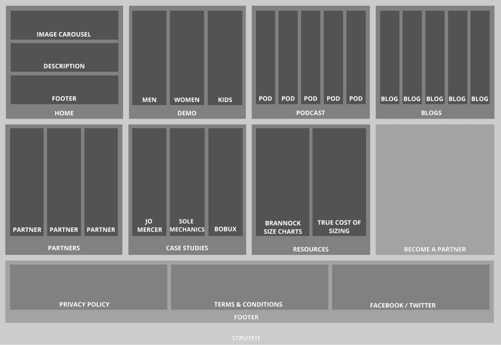
One key process of the research phase that I was heavily involved in, was analysing Strutfit's original site map. This self created translucent box method in particular, helped me to immediately identify which pages had significant friction through just seeing how dark the box was.
Keeping to the Process
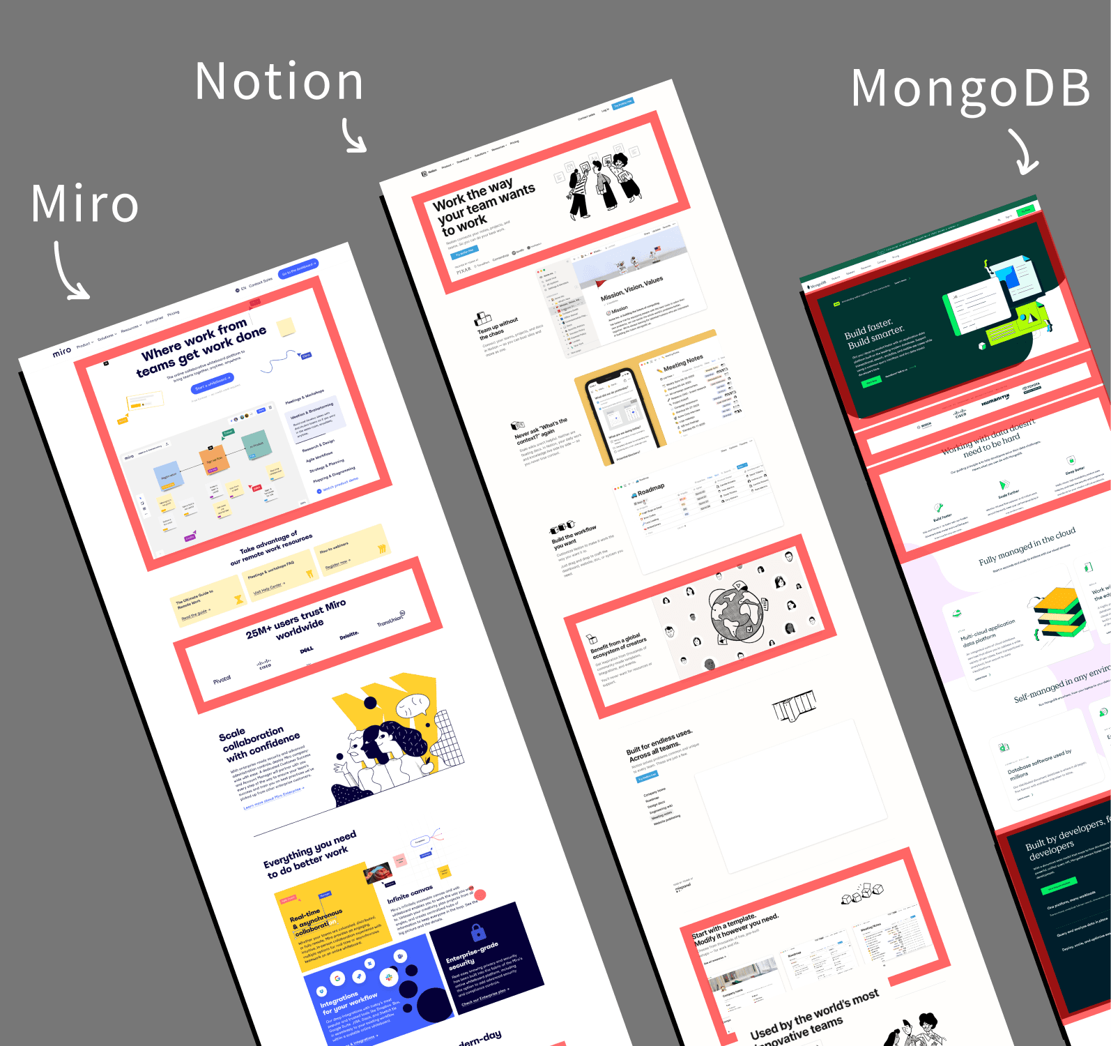
Without a doubt, one of my largest learnings in the project was the value of keeping to the process. In my haste to deliver, I often found myself skipping ahead in key parts of the process. This manifested itself in creating concepts and mock ups without deeper consideration on my design decisions or drawing inspiration from similar projects. But thankfully Ian, my PM, quickly called me out on this, and we were able to resolve it.
I was designing without truly considering the why. So I had to take a step back, and deeply analyse each section, drawing inspiration from existing examples.
Developing Concepts
We then truly entered into our concept development stage, where we used multiple core design skills to help refine and elevate our designs.
1. Working with a Grid System - Utilising a grid system across our page designs helped keep our prototypes consistent and clean.

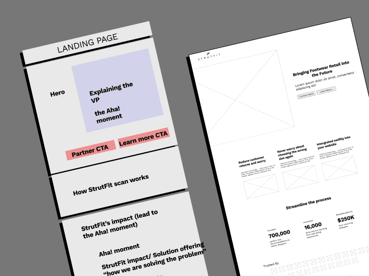
2. Working at Multiple Levels of Fidelity - By working from very low fidelity prototypes focused on the information hierarchy, up to more higher fidelity prototypes, we were able to pay attention to every detail of our pages.
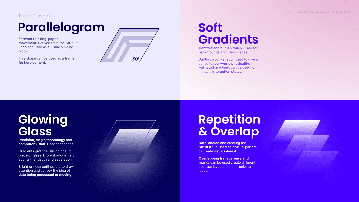
3. Considering the Branding as we design - Rather than simply just merging with the branding team at the very end, we co designed throughout the process to ensure harmony throughout the designs.
Final Delivery
Throughout the next few weeks, Ian and I then developed the full user experience and information hierarchy for Strutfit's new digital presence, with our key focus revolving around the home page and the product page.