Differential
The Context
Differential is a computational architecture studio working with practices, studios and developers around the world, and their business was growing fast. With that growth came a need for a portfolio that could properly represent them and help bring in new clients.
The Story
This is where I was brought into Differential's story, working with co founders Piotr and Krishna to design and develop their new portfolio. I led the UX, early visual explorations and the Webflow build, while Mark took the UI design further.
The Problem at Hand
With co founders and clients spread across the world, the challenge was to design something simple and distinctive at a glance, while clearly showing visitors what made Differential's approach different and just how far their work reached.
The Outcome
The new portfolio gave Differential a digital presence that matched the calibre of their work, anchored by an interactive landing screen, a globe showcasing their international projects, and refreshed iconography for their services. My work shaped the UX and visual direction from early exploration through to the final Webflow build.
Read about the design process ↓


Understanding the Landscape
Being new to the world of architecture, one of my first steps in this project was establishing an understanding of what the design landscape of architecture looks like and what could be done to set them apart.
But apart from just looking outwards, I also studied Differential's existing brand guidelines and talked with their co founders, Piotr and Krishna, to truly understand what they wanted personally, and needed commercially from their portfolio. And this gave me a few key requirements for their portfolio's design:
Keep the design super simple
Communicate what makes Differential so different
Convey Differential's international impact
Mapping the Information Hierarchy
With these requirements in hand, I got into brainstorming, sketching and planning out what the information hierarchy of Differential's site could look like, working through how a visitor would move from first impression, to understanding what Differential does, to seeing the scale of their work. This thinking became the backbone for the three key elements we'd go on to design: an interactive landing screen, how we'd showcase their projects, and how we'd communicate their unique services.

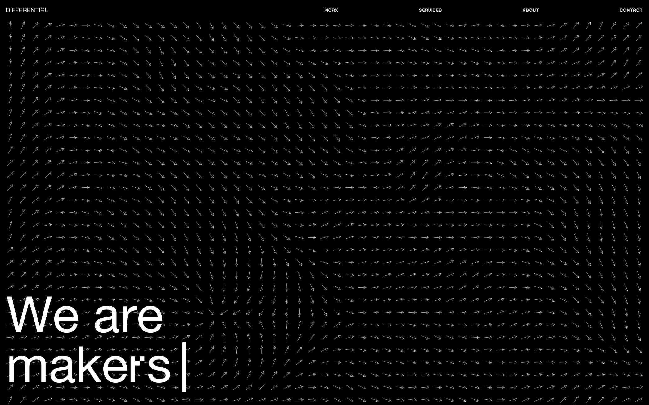
Designing the Landing Screen
Being the first impression that visitors and potential clients would see of Differential, nailing the landing screen was absolutely crucial. For this, it needed to showcase Differential's personality, be interactive, and be connected to their work in architecture. So we explored a few options:
Fluid Simulation
Connected to digital simulations and eliciting heat-map imagery.
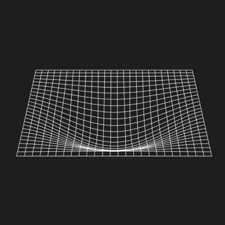
Gravity Grids
Reinforcing Differential’s parametric way of working through coded animation.

Vector Grids
Connecting to airflow and other directional simulations.

Animated Imagery
Focusing much more on Differential’s projects overlaid with ‘glitching’.
And finally after pitching and revising the options, we ultimately chose to move forward with the responsive vector fields alongside an overlayed text animation to introduce who Differential is.
Hover over me :)
Communicating Global Reach
With co founders on opposite sides of the world, and clients everywhere in between, Differential needed to communicate their projects in such a way, that it was immediately recognisable for potential clients, that they worked around the world. We explored a few options for this, from their existing list of projects, to a gridded world map.


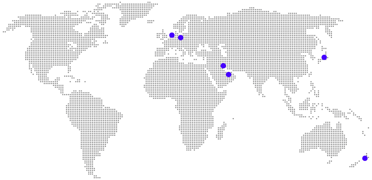
After sharing these ideas internally and getting feedback from the team, the most powerful option that came through was an interactive globe, one that invited visitors to get a personal feel for the international impact, with Krish later bringing this to life through the coded interactions.
Bringing It to Life
These solutions weren't decided on their own though, but rather they were part of an extensive and iterative design process, that took place over months. Once I'd put together our high level visual prototypes, Mark then refined and levelled up the design, which included many really insightful changes for me, as someone still growing in the field.
And when we had a design everyone was happy with, I got into developing it with Webflow, including building out the iconography for Differential's growing list of services, to maintain a consistent brand identity throughout.