NZ Herald
The Context
As part of NZ Herald's transition from physical to digital, they wanted their data visualisations to reflect the same premium quality as the rest of their brand, and brought us on to analyse their current systems and explore how this challenge could be addressed.
The Story
This project was my Master's final project, working alongside Yujin Shin and Daniella Pena, with Dean a UX Designer at NZ Herald as our primary contact, alongside their Head of Product Experience, Creative Director, and several other senior stakeholders across the business. My primary contributions were industry research and Figma development, taking our developed concept through to a high fidelity prototype.
The Problem at Hand
The challenge was to design a tool that could empower journalists to create consistent, high quality data visualisations reflecting NZ Herald's premium status, while fitting naturally within their existing suite of internal tools and workflows.
The Outcome
We delivered a bespoke graph generation tool, complete with flow, UI and a high fidelity prototype, giving NZ Herald's journalists a streamlined way to create consistent, on brand data visualisations, while also producing a research insights document to guide their future infographics work.
Read about the design process ↓
Context
With the transition from physical to digital, NZ Herald wanted to ensure that their data visualisations were presented to the same high quality as the rest of their brand. For this, we were brought on to analyse their current systems, how international industry peers handle this, and through discussions, develop an intervention that could help address this challenge for them.
Stakeholders
UX Designer (Primary Contact at NZ Herald)
We also worked with the Head of Product Experience, Creative Director at NZME, Head of Digital Production, Managing Editor of Audience and Platforms, and the Data Editor and Head of Data Journalism.
Team
Yujin Shin
Daniella Pena
Defining the Problem
To research the context of the project, we conducted interviews with both journalists and reporters at NZ Herald to understand their work process, thoughts surrounding data visualisations, and discover their key pain points. One of my main roles in this project was also analysing the data visualisations of industry peers, and summarising this alongside our interview insights into a research insights document for NZ Herald, one that would also serve as a starting point for their future infographics development.
Some of our main takeaways included:
There is a disconnect between interactivity and visuals across mobile and desktop, with data visualisations not translating effectively when the viewport changes.
The aesthetics of the data visualisations could be more purposeful and better aligned with NZ Herald’s brand to create a more cohesive visual identity.
Interactions and animations should be intentional, serving to either reveal additional information or actively support the narrative being told.
Accessibility improvements are needed, particularly in legibility and colour contrast, to ensure visualisations are easy to read.
Data visualisations should be achievable within existing tools such as Flourish or Datawrapper, or supported by a simple system with a low learning curve.
Clear signifiers are needed to guide users toward interactive elements and improve usability.
All of this culminated in our HMW statement:
How might we empower journalists to create consistent and high quality data visualisations that reflect the premium status of NZ Herald?
Concept Development
With our initial research done, we developed and pitched four different concepts, each with their own pros and cons, to our stakeholders. The final decision was to move forward with a bespoke graph generating tool, as it was the perfect match for the long term growth of NZ Herald's data visualisations, despite the higher initial cost of developing it.
Chosen Concept - Bespoke Infographic Generation Tool
Developing the UX/UI for a custom infographic tool that would layout the user journey of such a tool and how it could look.
System Add-on
An add-on to NZ Herald’s design system that shows the tokens and additions needed in the system for specifically data visualization.
System Microsite of Guidelines-on
Develop a microsite as a shareable prototype within the Figma design system that provides the needed information and resources for journalists to be able to confidently make their own data visualizations.
Consistency Guide
Develop a guide and resource for journalists and editors, that could possibly tie into the copilot agent to refer to when reviewing articles to ensure consistent implementation of NZH’s visual representation.
Developing the Flow and User Testing
With our concept chosen, we went through multiple rounds of flow and UI iterations before developing the final flow for the product and a mid fidelity prototype that we could run usability tests on.

Our User Testing revealed:
Insight 1
Although the landing page has all the crucial features of the program, it can seem overwhelming and unclear where to begin.

Insight 2
Although the landing page has all the crucial features of the program, it can seem overwhelming and unclear where to begin.

Insight 3
The layout and hierarchy of the landing page does not convey the first step of the main workflow

Insight 4
The prototype is well liked and intuitive to use but needs more signifiers and some wording needs to be rephrased.

Final Output
Our final output for this project was designing the flow and UI of a custom graph generating tool that sits within NZ Herald's current suite of internal tools for journalists, such as their writing editor and video uploading tool. This would streamline the experience and usability from a journalist's point of view, and ensure long term stability and consistency from the company's view.
A key part of this project was exploring how AI could integrate into the tool. From our research, we found it had great opportunity serving as an aid in making recommendations and identifying opportunities, but limited ability in actually executing those changes. Because of this, our final solutions, both here and at the review, recommend changes to aid journalists, without trying to override their experience and skills.
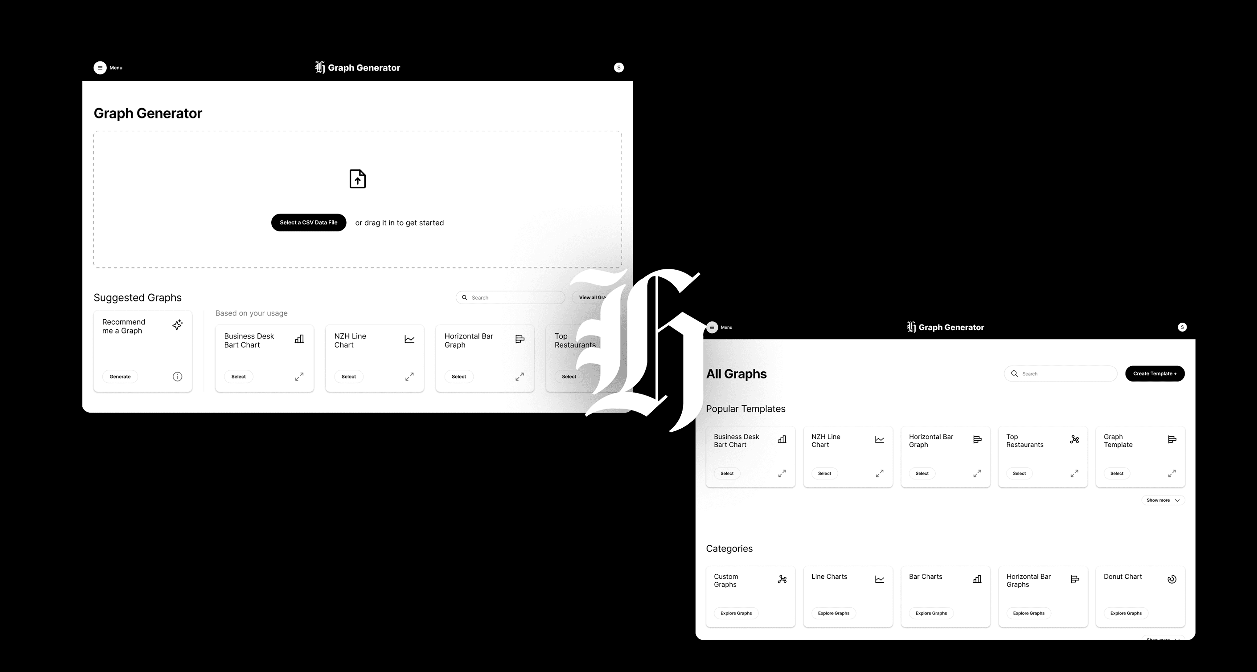
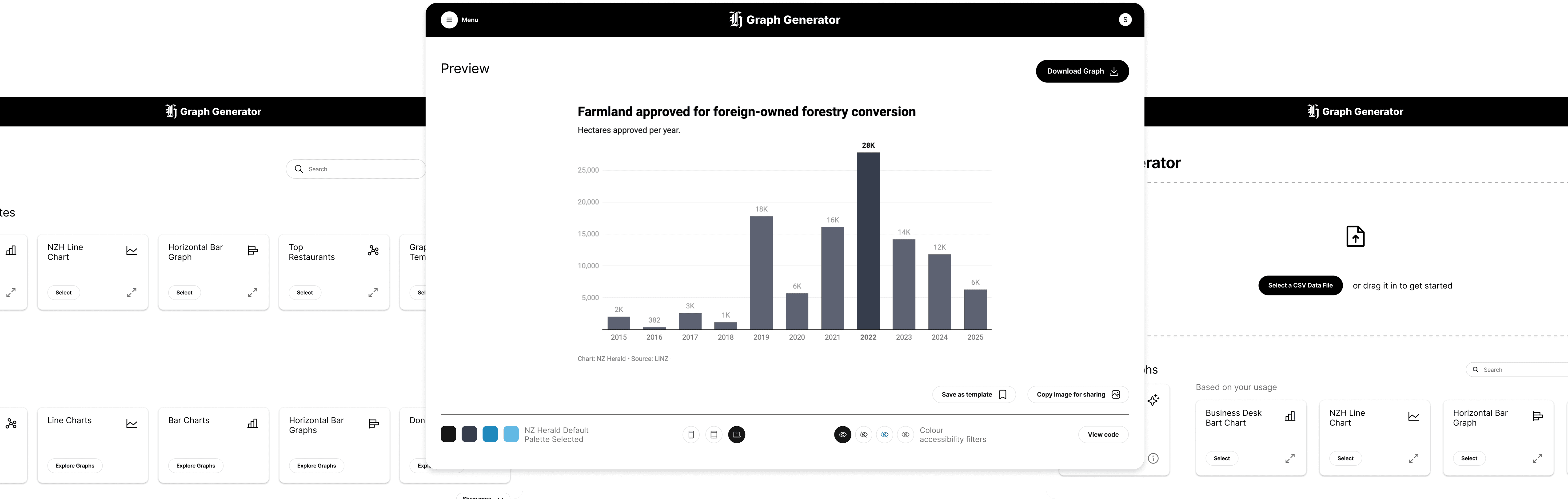
Recognising journalists' existing workflows and systems, we designed the platform to integrate seamlessly with tools they already use, building the UI using NZ Herald's design system. In light of our research findings, we also aimed to make the process of creating data visualisations as simple and straightforward as possible, placing all essential tools on one page so users could access everything they needed without friction. This step by step process is presented in a vertical, scrollable layout, allowing users to follow each stage in a natural flow.
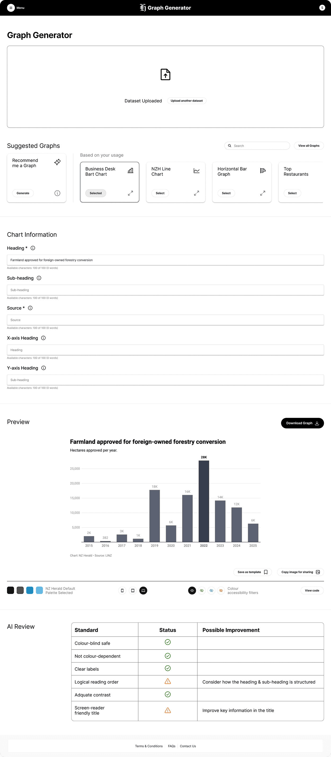
Users can customise the colour palette to their needs, with a few set palettes to choose from, and editable code is also available for those who want to apply animations and more interactivity for the tech savvy. Users can also publish their created templates within the site and save graphs to use in their articles, since data visualisations and articles often require approval and multiple revisions before publication, with a quick copy image feature supporting easy sharing between users.
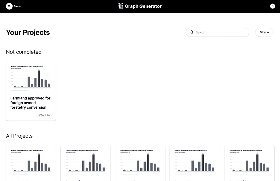
On top of the core graph generation page, we also developed a graph repository for journalists to develop and share templates around key topics, and a projects page to revisit old projects or pick up where they left off, allowing the tool to serve as a much more holistic experience for journalists.